Designing Better Experiences
I lead teams through research, evaluation, and iterative design to improve key user journeys, navigation, and conversion paths. My focus is on creating experiences that are intuitive, user-centred, and aligned with both real user needs and wider organisational goals.
World's Biggest Coffee Morning
Macmillan Cancer Support
The World’s Biggest Coffee Morning is Macmillan’s flagship fundraising event and has raised over £337 million since it began in 1990. The website plays a crucial role in the campaign, driving around 70% of all registrations.
As a Senior UX Designer, I was responsible for redesigning the homepage, navigation, registration journey, donation flow, and several other key touchpoints across the site. My work focused on improving usability, clarifying information, and increasing conversion throughout the user journey.
Website Evaluation
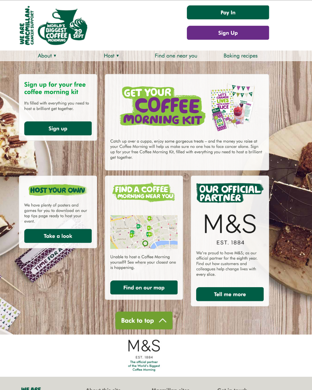
When I joined the project, the WBCM website was outdated, lacked a clear hierarchy, and was missing essential information. Users struggled to understand what the event was, how to take part, or where to begin. Key journeys contained multiple points of friction, contributing to drop-off at critical stages.
I started with an expert evaluation to identify the most severe usability issues and quick wins. Improvements that could be addressed immediately by the Content team were implemented without delay.
To build a deeper understanding, I collaborated with students from City, University of London, who conducted usability testing with over 100 participants. Their findings validated our concerns and provided additional evidence to inform the redesign.
Homepage Redesign
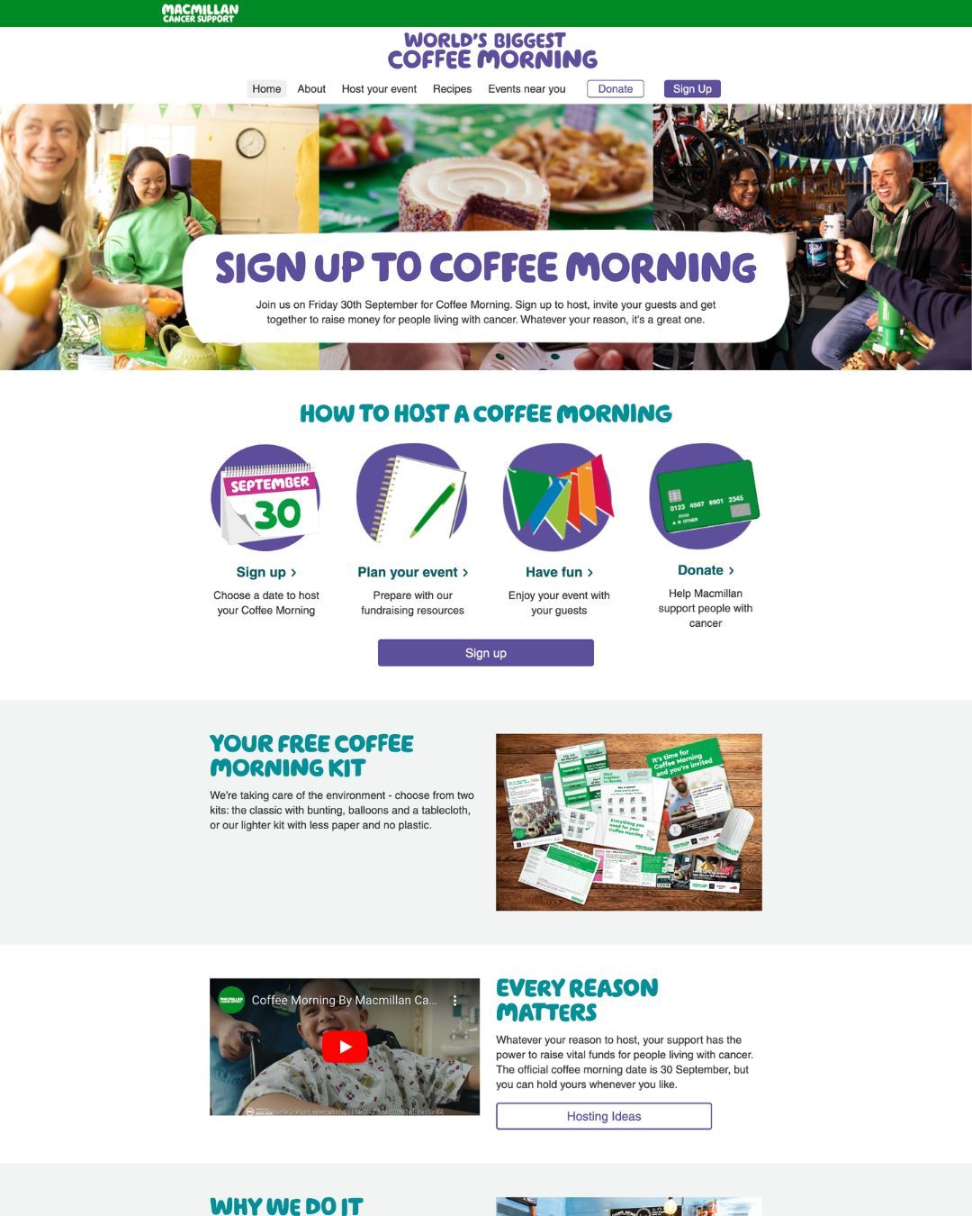
The homepage was one of the most impactful areas to redesign. The original version failed to communicate the essentials: what WBCM is, why it matters, how to organise a Coffee Morning, and where to get started.
I restructured the homepage to provide clearer signposting, stronger messaging, and a more intuitive flow that supported different types of users - hosts, participants, donors, and supporters. This included improved explanations of the event, direct routes to registration, and easier access to guides, resources, and tools.
Because WBCM is a timed national event, I also designed different homepage variants for the before, during, and after phases of the campaign. These versions were manually deployed to ensure users always saw the most relevant content - from encouraging sign-ups, to providing hosting tips, to prompting users to pay in their fundraising money once the event concluded.
The redesigned homepage delivered a clearer, more welcoming entry point, helping users understand the event and take action quickly.
Improving Navigation
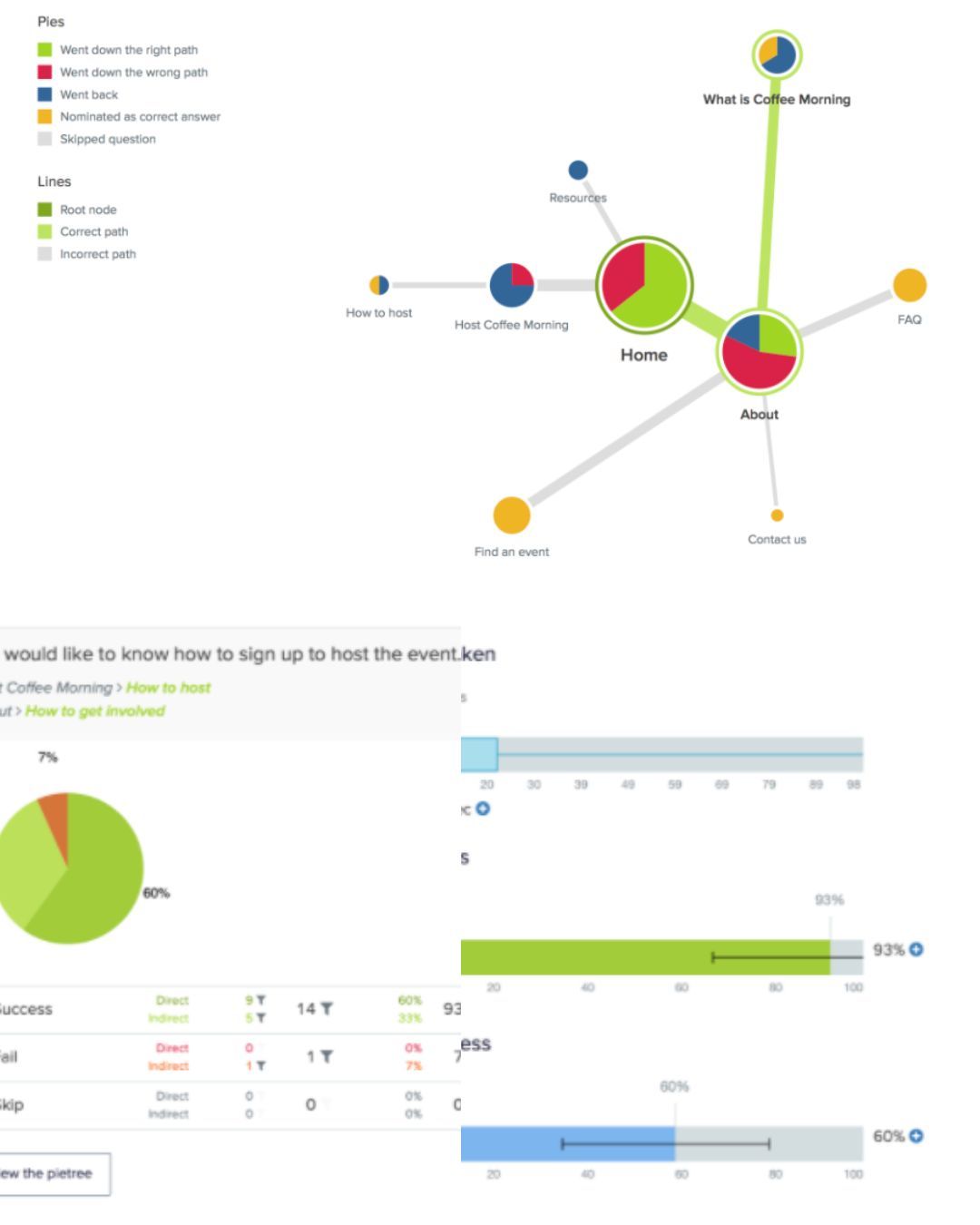
To address wider issues with information findability, I conducted tree testing with 30 users using Optimal Workshop. The results confirmed that users struggled to locate core tasks and that the existing structure did not reflect how they naturally looked for information.
I combined these insights with heatmap analysis and Google Analytics data to understand how people interacted with the site in real use.
Using this evidence, I ran an open card sort to identify a more intuitive grouping of content. After designing a revised navigation, I validated it with another round of tree testing.
Results:
-
80% overall findability
-
Four tasks reached 100% success
-
Remaining tasks improved by adding clearer content and better cross-linking
This foundational work ensured users could move through the site with significantly greater ease and confidence.
Redesigning the Registration Journey
The registration journey was one of the most important flows on the WBCM website. After evaluating the form, I redesigned it to simplify steps, reduce friction, and create a more intuitive experience.
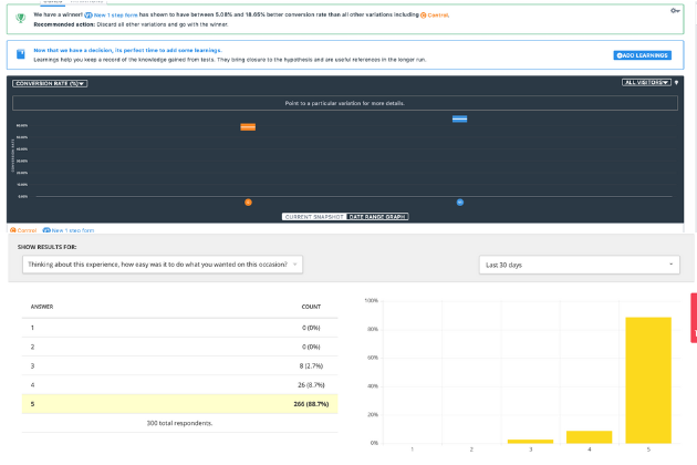
We validated the improvements through an A/B split test, which predicted at least a 5% uplift in conversion. The new version was released.
Actual results:
-
Completion rate increased from 62% (48,945 registrations in 2017) to 84% (124,166 registrations in 2018)
-
A post-registration survey of 300+ users showed 97% found the process easy or very easy
These changes significantly improved both conversion and user confidence in completing the sign-up journey.
Results & Impact
The redesign significantly improved the usability and clarity of the WBCM digital experience. Key journeys became smoother and easier to complete, resulting in a marked increase in registrations - rising from 62% to 84%, with over 124,000 people completing registration in 2018.
Navigation clarity improved following a complete IA overhaul, achieving an 80% findability rate, with several key tasks testing at 100%. User satisfaction was also extremely high, with 97% of surveyed users finding registration easy or very easy.
These improvements strengthened the digital foundations of Macmillan’s largest fundraising event, supporting higher engagement and reducing friction for participants across the UK.
Longest Day Golf
Macmillan Cancer Support
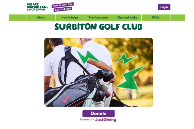
Longest Day Golf Challenge is one of Macmillan’s longest-running fundraising events. While the challenge is hugely popular with returning golfers, the digital experience had become confusing and difficult to use, and the 2018 microsite underperformed.
My role was to understand what wasn’t working and redesign the experience so golfers could register, create teams and fundraise with ease.
Project Background & Problem to Solve
Before 2018, LDG lived on the main Macmillan website, which meant registration journeys were fragmented and people often got lost in unrelated content. A standalone microsite was launched for 2018, but it still caused confusion, and the campaign underperformed. Even highly motivated fundraisers were dropping out because the digital journey didn’t guide them clearly enough.
Going into 2019, the priority was to fix the core usability issues and simplify the journey - especially around registration, team creation and linking fundraising pages. My goal was to identify where golfers were getting stuck and redesign the experience so the whole flow felt intuitive and clear.
User-Centred Design Process
To understand why golfers were struggling on the Longest Day Golf website, I began with an expert evaluation and followed it with usability testing on the live microsite, interviews with returning golfers, and a review of post-event survey insights. Across all activities, we saw the same patterns: golfers weren’t sure where to begin, the team setup process was confusing, linking or creating a JustGiving page created hesitation, and many participants became stuck when trying to pay in their fundraising money. Even highly motivated fundraisers were dropping out because the digital journey didn’t guide them clearly enough.
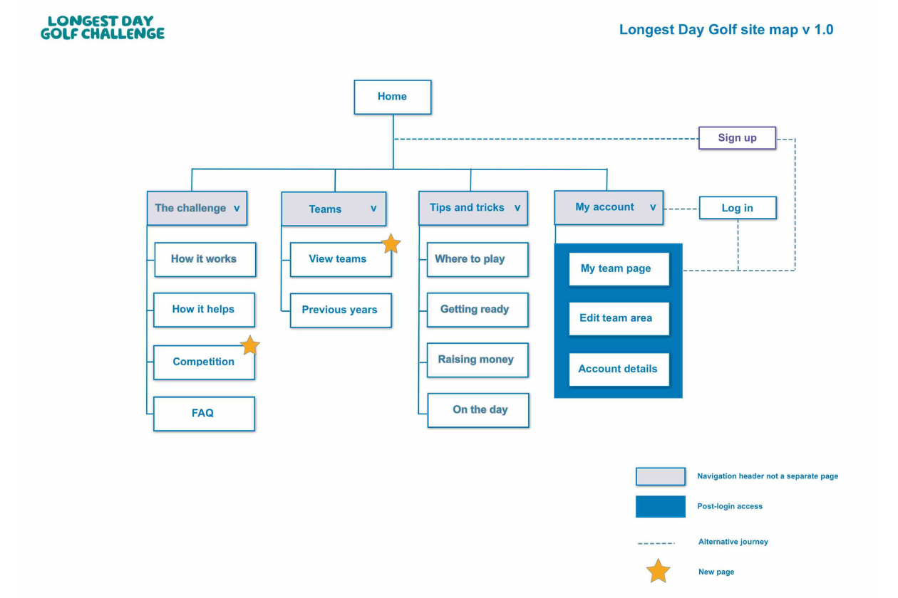
Because many of these issues were rooted in the site’s structure rather than individual screens, I analysed the information architecture and ran tree testing to assess how easily users could find key tasks. The results revealed unclear labels, overlapping pathways, and too many competing choices at the start of the journey - all contributing to unnecessary frustration. The testing also highlighted significant pain points around the pay-in process, where users struggled to understand what “paying in” meant, how it connected to JustGiving, and what steps they needed to take. These insights informed a redesigned IA that clarified terminology, simplified the routes between core tasks, and made the pay-in journey far more intuitive.
Designing Improved User Journeys
All research insights were consolidated into a set of redesigned user journeys that aligned more closely with how golfers naturally approached the challenge online. This included simplifying the registration flow, clarifying how teams are formed, restructuring the homepage to guide users into the right paths, and redesigning the pay-in experience so golfers clearly understood how to submit their fundraising money. Each journey was refined to remove unnecessary decisions, reduce cognitive load, and support momentum throughout the challenge.
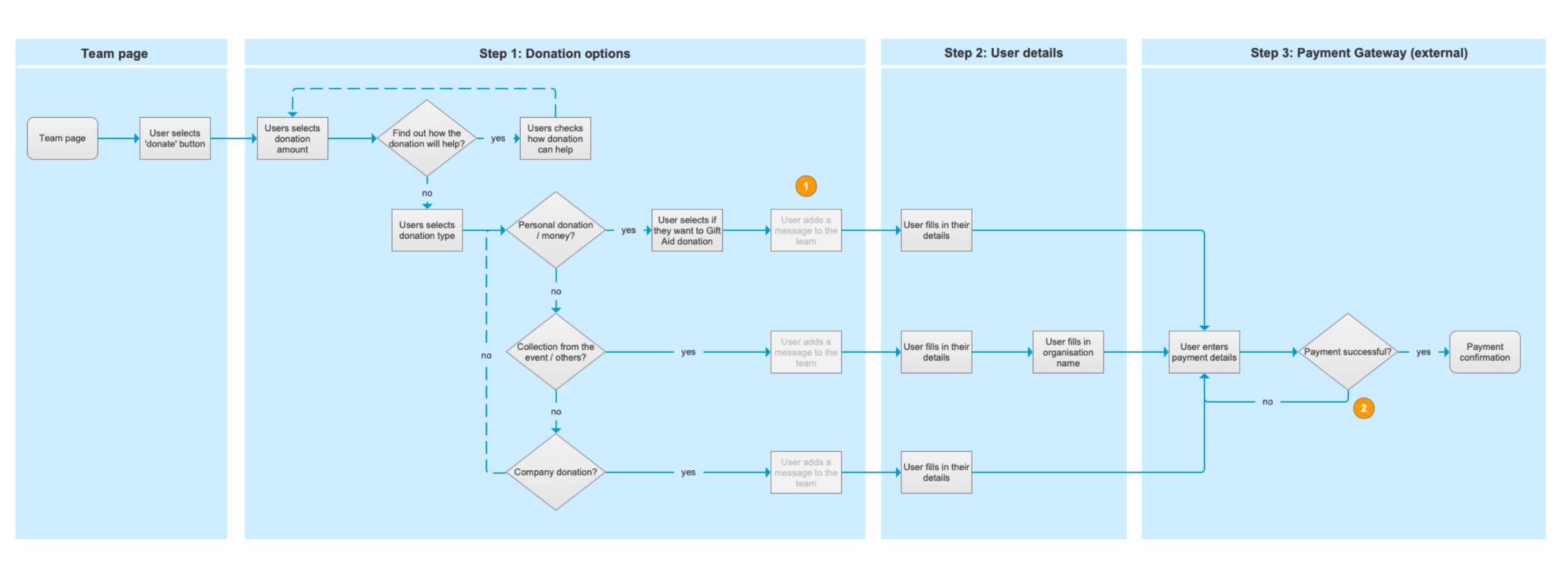
These new journeys were iterated and validated through further rounds of usability testing, ensuring the solutions addressed real pain points and resolved the friction we repeatedly observed in the original experience. This work provided a solid foundation for final visual design and development.
Redesigning the Gift Aid Process
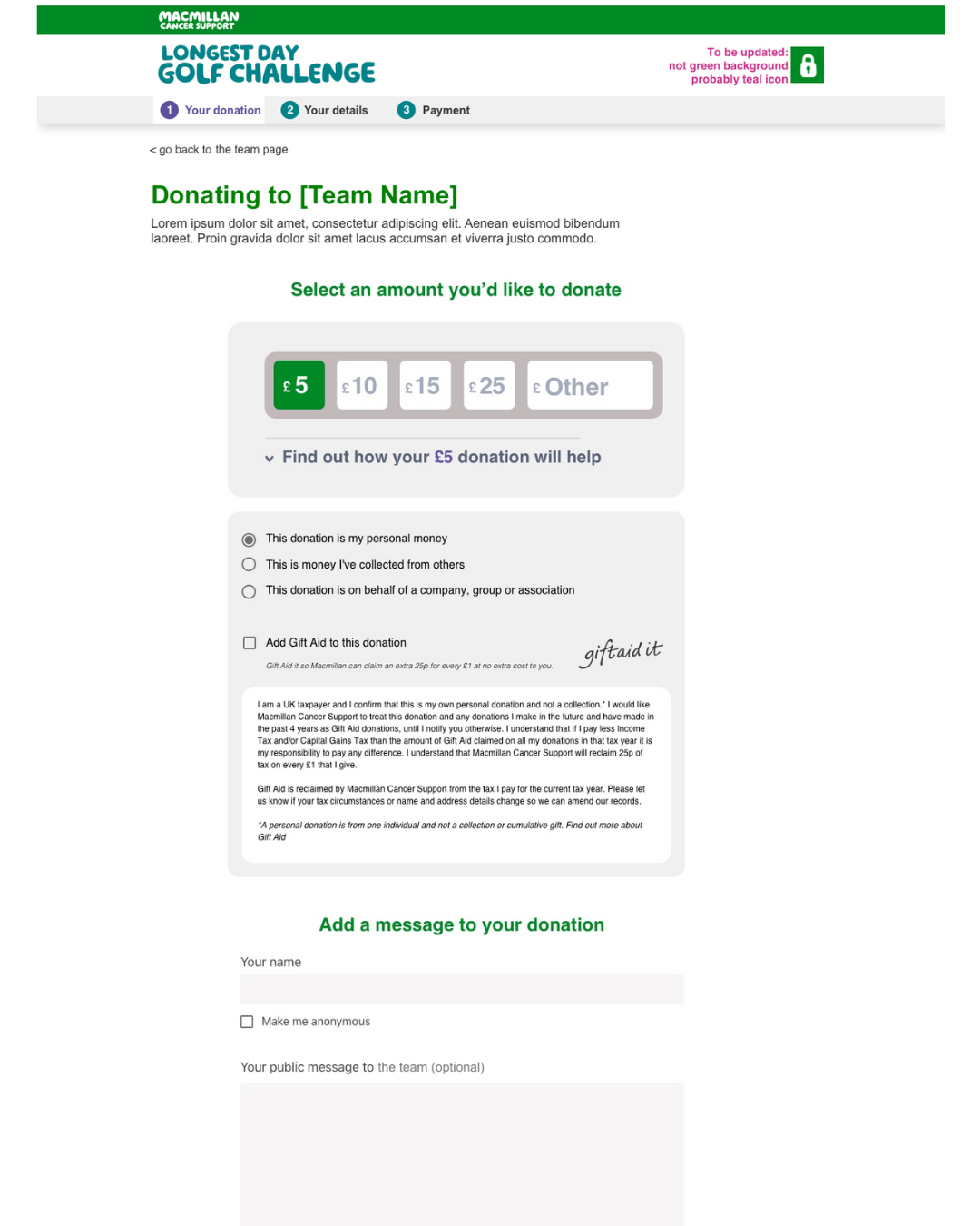
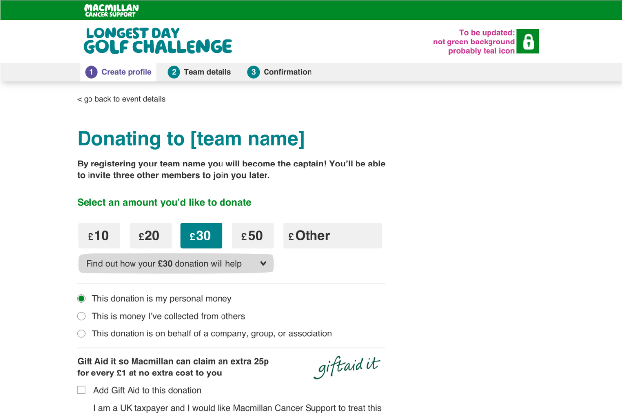
A significant part of the LDG improvement work involved redesigning the Gift Aid declaration process. At the time, HMRC’s requirements were extremely prescriptive, and the existing journey created confusion for donors — risking both user drop-off and potential loss of Gift Aid income for Macmillan.
I was responsible for designing a clearer, more intuitive GiftAid experience that would still remain fully compliant with HMRC’s rules. I collaborated closely with internal teams and negotiated directly with HMRC to ensure that the proposed journey met legal standards while supporting a positive donor experience.
The final Gift Aid flow was accepted by HMRC without amendments and went on to be referenced as a strong example for other charities. It successfully balanced compliance with a much more user-friendly design, protecting Gift Aid income while reducing friction in the donation journey.
Results & Impact
The impact of the redesign was immediately visible. Shortly after launch, the team announced that the 2019 Longest Day Golf Challenge had smashed its fundraising target, raising £1.46 million against a goal of £1.2 million. The internal response reflected how significant this was: “an incredible result, and a big hats off to everyone who helped deliver this project.”
The redesigned journeys - particularly registration, team setup, and paying in money - removed critical friction points and supported significantly higher participation and fundraising completion.
How I Can Help
I support organisations with UX, accessibility, Design Ops and digital transformation. This can include improving design maturity and ways of working, building and developing UX teams, coaching and mentoring, strengthening cross-functional collaboration, and embedding inclusive, user-centred practices into everyday delivery.
Get in touch